

Building Website for a CrossFit Gym
Recently, I've taken on an unusual side project -- making a website for a CrossFit gym.
It is unusual in a sense that I am to not just write code, I am my own PM, designer, developer, and devops -- all at the same time. And guess what, sometimes I had to make up content for the gym owner as well, because the gym owner is a man of few words. Anyway, here's how it goes.
Finding the grounds
Before trying to make this site, I had little idea what a CrossFit gym is. I may have heard of the term once or twice, but I had no clue what it is all about and what their communities are like.
Likewise me having little knowledge about the contexts, they also knew little about Internet products. The gym had an existing site... lacking care. Let's just put it that way. Much of the content grew out-of-date as the gym developed. They felt really uncomfortable making changes to the site. And I don't blame them, not at all. The gym is hosted on Wordpress. When I first logged on to the backend, I was shocked myself. There were so many plugins and configurations flying around, so much so that I couldn't even tell the nested level of the sidebar anymore. Some of the plugins are very technical, some others only make sense if certain template is enabled and if not -- the pages become templated texts that read like rubbish. But many of the plugins were unused and nobody dares to remove them. Look at the "good job" us software engineers have done. I guess that's why Wordpress specialist is a profession. The idea is nice -- everyone can make a website. The reality? It's too much to ask.
To get going, I started fixing some minor issues on their existing site. Such things like fixing the copyright text to reflect current year, removing irrelevant content from templates, trying to fix some plugin issue, etc. I'd say I'd obtained "just enough" knowledge to work on a Wordpress site.. How a PHP server runs, how it introduces plugins, and most importantly where are all the static files and templates. I was also debating between whether to keep using the current site (template) or to build a new one from scratch. The "scratch" further breaks down to a scratch Wordpress site? Or a true scratch.
Eventually, I decided to stay with their hosted Wordpress site because we wanted to keep the potential of starting a blog, which is what Wordpress specializes in. We also then kept the access to the ecosystem of plugins, which saves me a lot of effort building a server. Although, we decided to scratch the old site and build a new one.
Designing the site
To come up with a design, I started by looking into what others gyms' sites are like. I asked for a few names in town, but none of them has a passing site (ok my standard is unusual but still). So I ended up searching for CrossFit gyms in a few of my favorite cities. I really enjoyed this process, I felt like I was visiting the city again.
Since this is an unusual post about CrossFit, it would be wrong of me to not leave you with a few sites that are brilliantly done. Check this out: myleo. This is a box in Berlin. The powerful outlook embraces a very classy choice of typography. And as you scroll down, past those colorful images, you see a plain white piece of paper, that's their billboard for WOD. Such use of the direct opposite design element to deliver the message was striking to me.
Check this one too: CrossFit Grenzgänger. I think it's likely done by a developer. The whole site is just 1 page with hashed anchors, that it uses a Google Spreadsheet gives it out.
 .
.
While I visited the sites, I tried to think how I felt about the site. I pretended to be someone looking to try CrossFit myself. What questions do I have? Did I find the answer? Did I like the gym? Might I have signed up if that's the gym near me?
Organizing site content
Having in mind what classes the gym offers, I've outlined the site to have the following pages:
- home page
- about page
- programs page
- ...various program pages
- pricing page
Other than the home page, which I want its content to be rather flexible, all the other pages have their very clear and specific purposes. The about page is supposed to tell people what the gym and the community are like. The programs pages should outline what is covered in each course, and let people know what to expect. The pricing page should list out all the prices with links to payment pages.
Under the hood, I also want every single page to come with a cause of action. What this means is I don't want users to land on a page and get stuck there -- I want to nudge them towards making a commitment. So, from home page, I lead people with different background to CrossFit to their most relevant section in the about page. For pages with a lot of content, I append a contact form (which I later changed to "WhatsApp Us" button), so they can ask or comment on things after absorbing the content. All programs pages eventually lead to their corresponding payment pages. And pricing list of course goes to the payment pages.
Theming and typography
Theming is almost easy for me. I've simply taken their existing logo, and picked colors from there. The tricky part is to make sure that there is enough contrast before foreground and background. I think the color combo does it well.
I've also taken the chance the simplify the logo a bit. I like the minimalistic look now, feels modern.
Layout
Most pages are 1-sectional with responsive adaptation to smaller screens. Apparently I'm known to have a peeve about horizontal overflow -- I cannot tahan wiggling sites on mobile screens.
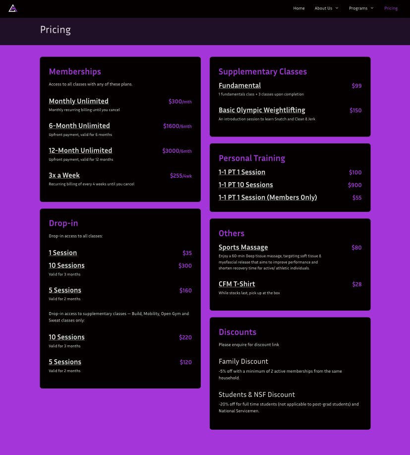
When it comes to page layout, I found pricing page the most interesting to make. The gym has a lot of different tracks of memberships, how to make them visually clear is a challenge. I've made references to many commercial gyms and climbing gyms, and eventually given it a 2-column, sectional layout that the owner also agrees with.
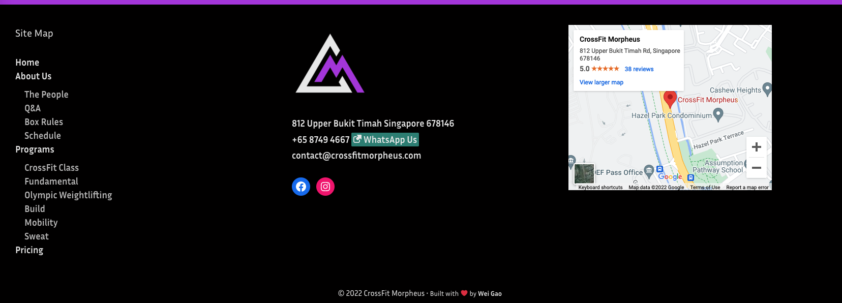
The other thing I really like about this site is the footer. I always like sites that have a nice footer. Check Helen's. Secretly I believe footers are what makes a site legit. They make the tiny details that leave an impression which your emotion will remember. It's very much like the kind of warmth you get from those kind hearted friends who farewell you well.
Tracking with Umami
Umami has done it right. It lets you track default behavior with just an SDK. And additional events are simply marked using a CSS class -- such an ingenious approach. This combo satisfy all my needs thus far. And the dashboard is neat and tidy. Those brothers deserve all my praises for getting tracking done right.
Speaking technical terms to non-tech people
This turned out to be a first (rather unexpected) challenge. The first time, I scheduled a meeting for an hour to discuss what I usually cover within half an hour, and ended up spending close to two hours covering only half. And that is because, the moment we start discussing, I realize I need to discuss much more context to make sense of myself.
Take site SSL as an example. That first day the project was incepted, the gym owner showed me the "insecure" logo on the address bar for his site and asked me what it is. Then I realize it wasn't what it is that is significant, but rather why it shows up and how to make it go away. I really felt that my true effort in explaining why SSL matters went down the drain, only that "it's good for SEO" registered. Anyway, in the next couple of weeks I was exploring various options based on the site's tech stack to try to get them an SSL cert. Throughout the course, I encountered a few times an ISP issue where phones under certain network could not open the site.. I had guesses why that happens, but guesses won't solve problems. I'm glad that the owner didn't blame me for those down times.
Platform as a service for gyms
By helping my gym with their site, I had a couple of encounters with PushPress, a company building products specifically for gym management.
They're a very small team with only a few dozens of employees. It's quite impressive to me that they've been around for 6+? years and are now serving more than 1200 gyms all over the world. (It's even more impressive how CrossFit becomes so successful a trademark that even its 2nd and 3rd relevant service providers become sustainable businesses.)
PushPress and MindBody App essentially build just one app. They provide modular services to gyms, and individual account interfaces to gym goers. They're not perfect, the system is buggy at times, the localization isn't great neither. But in the end from what I can tell they really nailed the most essential features. By "essential", I must mention a screen app. It's a TV app that gyms use to display workouts and who's joining the session. It's very cool. I didn't even know such thing exists and that you can develop it (of course you can!). So yeah.
What has it done to me
I've never had experience at an agency before. So making this website closes that gap for me. But I think what still stands out in this case is that I have been working the site with in mind the success of the business (instead of merely just the website). That gives me an objective perspective and place the website as only part of the resources we have. I'm personally learned so much from the gym owner about CrossFit and physical training, as well as his minds on running the business. And, I would like to give CrossFit a try myself too.
It also gives me my first baby site for someone else. If you'd like to take a look (or try CrossFit, as I'm doing now!), here it is: https://crossfitmorpheus.com