Understanding the Cubic Bézier Curves
A bit intuitive exploration of the math and physics behind Bézier curves.
Intuition
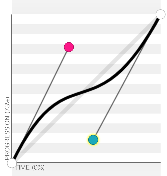
Omitting the construction details, a cubic Bézier curve is a [0,1] curve with at most two smooth turns.
With CSS, a cubic Bézier curve is defined by four points. The first point is (0,0), the last point is (1,1), and you need to supply only the second (x1, y1) and the third (x2, y2) points:
cubic-bezier(x1, y1, x2, y2) /* you drop the French accent mark, too */You can play around with the cubic Bézier curves at this website.
Intuitively, think of a cubic Bézier curve this way: You leave the origin (0, 0) towards the direction of the second point, and arrive at the terminal (1, 1) after bending towards the third point. I think of the smooth turn in the middle as the joint of the two forces.
Linear, Quadratic, and Cubic Bézier Curves
There are some interesting mathematical characteristics of Bézier curves.
If you glue two “free” points together, you get a lower degree Bézier curve — you make one fewer turn. So dropping one point from a cubic Bézier curve gives you a quadratic Bézier curve. And dropping yet another gives you the linear curve.
Here's cubic-bezier(.23, .86, .23, .86):


While the standard CSS easing functions allow for cubic Bézier curves, they don’t necessarily go into that third order.
CSS's Animation Timing Functions
linear is the trivial, "first order" linear Bézier curve.
The ease-in and the ease-out are both quadratic. This can be seen by the numbers. The ease-out, cubic-bezier(0, 0, .58, 1) has the second point (remember you don’t need to define the first point, so 0, 0 define the second point) joined with the starting point. And the ease-in, cubic-bezier(.42, 0, 1, 1) has the third point joined with the end point. As you may as well easily seen in the graph, you make only one turn.

A lot of physics can be expressed with the quadratic Bézier curves already. Item dropping, for example, is simply “easing-in”. I haven’t computed if the standard ease-in matches earth’s gravity or not — there should be a planet where it matches.
For a nice visualization of ease-in and ease-out, check out these material design’s illustrations. Please do take a look at the accelerate easing there. It speaks for the scene.
The ease and the ease-in-out are cubic. There are two turns in both these curves. Pendulums are “easing-in-out”. You move faster and faster towards the bottom, and slower and slower towards the two ends.

One way to know when you need a cubic Bézier curve is when you find two forces. Throw an object into the sky. You apply an initial throwing force, this supplies the direction of your first intermediate point. At the same time, as gravity is constantly pulling your object towards the ground, the trajectory is going to bend towards the second intermediate, before stopping at your desired location, or hit the ground.
Now it should become really straightforward to create animations that look real. Think about what forces are applied. Visualize that with your Bézier curves, and apply to the translate.
Sometimes we simplify the reality a little bit, assuming the object was just given an initial speed. Like a message flies in from beneath and stops at your eyesight. It's blunt, there's no throwing. It just happened. Nothing spectacularly wrong with an ease-out, but I guess our subconscious will love the ease.
Practice
So I was trying to reverse engineer the animation in this design:

Pendulum
At first sight, it looks like an ease-in-out, like a pendulum. A frictionless pendulum swing is symmetrical. I should be able to create this with an infinitely looping reversing quadratic function. I can pick either way, going up or down, and reversing it gives the other direction.
@keyframes one-way-pendulum {
  0% {
    transform: translateY(0);
  }
  100% {
    transform: translateY(1500px);
  }
}

.card {
  animation: one-way-pendulum 1s cubic-bezier(0.6, 0, 1, 1) infinite;
  animation-direction: alternate;
}
It works! But wait, it's not pausing!
https://codepen.io/wgao19/pen/pqMdJe
Pausing Pendulum
CSS animations' looping scheme does not offer a too obvious way to implement a pause between iterations. You would have to implement the gap by combining the loops. See this stackoverflow discussion.
This means that my animation would have to include both ways of the pendulum. Up and down. So a quadratic Bézier curve would not be enough. I really need the cubic one.
@keyframes pausing-pendulum {
  0%,
  20% {
    transform: translateY(0);
  }
  40%,
  50% {
    transform: translateY(1500px);
  }
  70%,
  100% {
    transform: translateY(0);
  }
}

.card {
  animation: pausing-pendulum 4s cubic-bezier(0.5, 0, 0.5, 1) infinite;
}
Now it nicely pauses between iterations.
https://codepen.io/wgao19/pen/VqorvR
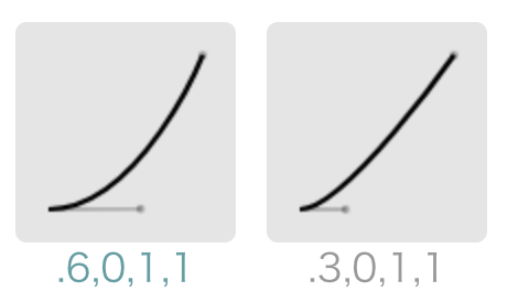
Which Bézier Curve Is Faster?
The three-card animation looks cool, one falling after one another. To me it looks like they're animating at the same time, but with a different gravity. The main card starts off slowest, the second card is a bit faster, while the third card the fastest. They come back with the same reversed speed, too.
So that first perpetuo should still work. All I need to do is to give the other cards a more drastic Bézier curve.
animation: pendulum 1s cubic-bezier(0.6, 0, 1, 1) infinite; /* the front most card */
animation: pendulum 1s cubic-bezier(0.3, 0, 1, 1) infinite; /* this one is faster */
animation: pendulum 1s cubic-bezier(0.1, 0, 1, 1) infinite; /* fastest of the three */
Note that the .3 curve is faster than the .6 one. The .6 curves bends more drastically, it means it's slowing down faster.
Now we have those three perpetuo cards..
https://codepen.io/wgao19/pen/WLVXXp
🐛🐛🐛
To replicate the pausing for the tri-cards, you just play with the numbers. EZPZ now 🐒. Note again that the less drastic curve has a faster initial dropped speed.

animation: pausing-pendulum 4s cubic-bezier(0.5, 0, 0.5, 1) infinite; /* main card */
animation: pausing-pendulum 4s cubic-bezier(0.5, 0.1, 0.5, 0.9) infinite; /*  faster */
animation: pausing-pendulum 4s cubic-bezier(0.5, 0.2, 0.5, 0.8) infinite; /* fastest */https://codepen.io/wgao19/pen/BvXmxQ