New Dev Blog Site with Nextjs (and New Design)
, updated
For combined reasons, I've long been hoping to migrate my dev blog from Gatsby to Nextjs. I had a prior attempt that ended up in wip branch forever because I was attempting to change too many things at the same time - the tech stack migration, trying out tailwind css, adding cookie confirmation, etc. After a few months, I got sick of working on this at bit-sized progresses and decided to ditch the long suspended project and start all over again, this time do only one thing: the migration.
The Nextjs migration is fluent and interesting, which I might write about in more detail in a separate note. There is one other thing want to have some remarks on is the aspect being "left out" by doing one thing at a time, even rather intentionally, and that is both the old and the "new design" of the blog.
Old site design and layout
If you've landed on my site previously, you might have seen this:
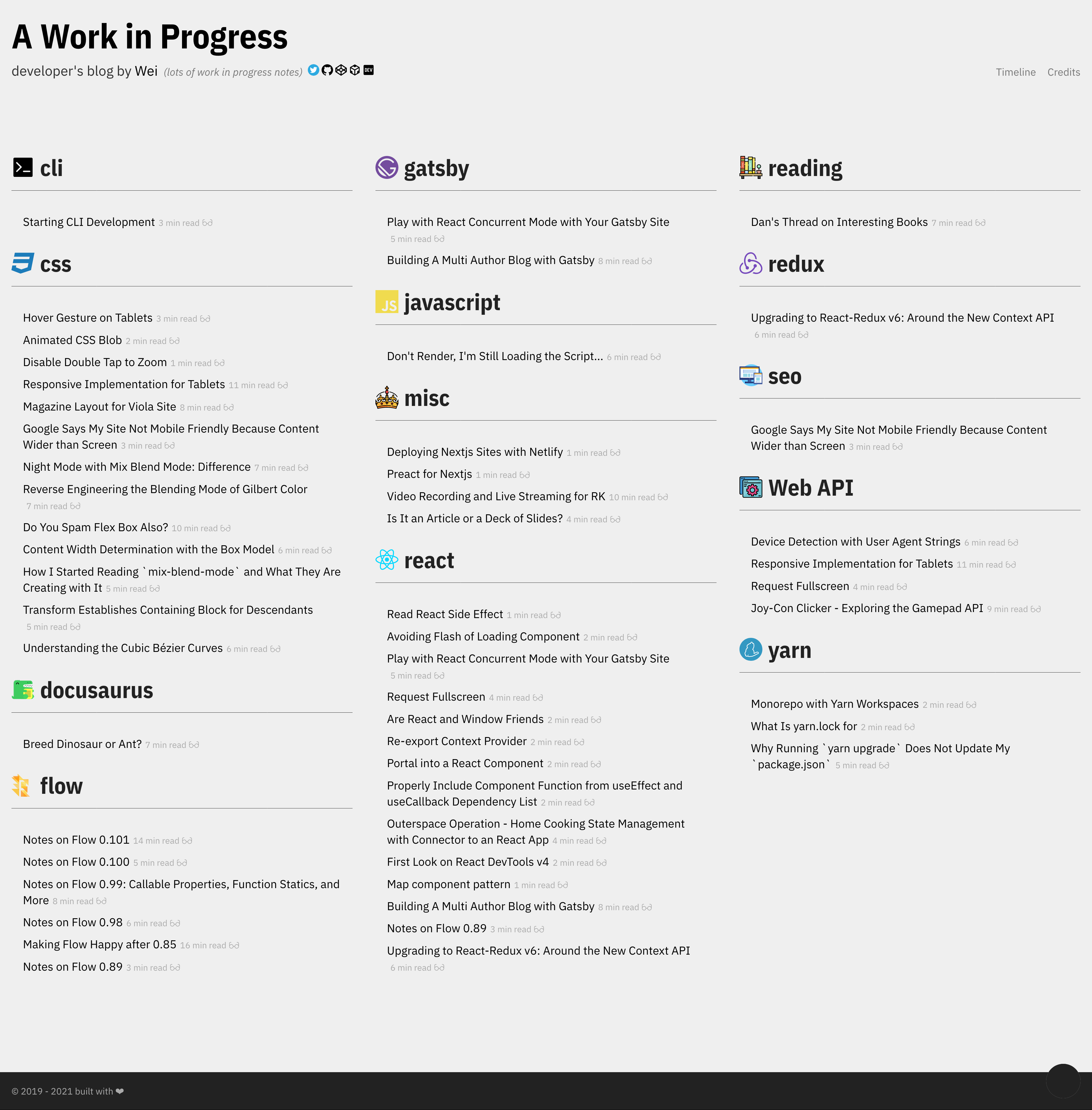
The old site followed Stefan Judis's site's "Today I Learned" section, and has reused most of his design element with his acknowledgement as well. I've really enjoyed this layout for the past two years, and you can still see some reminiscent of it in my viola site – the columnized layout for the listing. I'm sure one day I'll bring back this layout for the topic-based listing.
Coming out from a personal interest in how we present information on websites, for topic-based listing, columnized layout is by far my favorite. It's highly efficient because it makes the most use of the wide screens people have nowadays. It's particularly fitting for the audience of my dev blog, most often other developers. By breaking down the page vertically into multiple columns, we can expect the normally not-so-long titles to fill the column widths. And the page won't grow tall very fast because the height is re-used.
The technique I favor here is CSS Multi-Column Layout. It's designed specific for this kind of usages and its support is acceptable. The key difference between this and manual implementation is that the css-multicol instructs the browser to compute the final content height, taking into account the list's height and the viewport width at the same time. So while the list grows vertically and the widths may change, the columns will always end up ending at closest possible height together.
Vanilla new site visual
Following the said descipline, do one thing at a time, and due to the fact that I've used up all my design talent in my profile and viola sites, finally I'm now a proud sitemaster of a website of this timeless design put together with near vanilla html (15 lines of css) and web safe fonts.
If I say there is "no design", that's not respectful to our very early senpais who designed what plain html would look like. After I finish the whole site I am very delighted by it, it's completely robust, fully adaptable to all screen sizes. The page has clear hierarchy, you won't mistake an h1 for an h2, a list is a list and a link is a link (I'm surprised how even this needs to be appreciated). Subjectively, I think it has a classy look.